Offbeat Artistic Observations ~ Shape Shifter ~ |
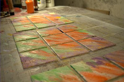 |
| Picture 1: the first proper painting stage after the primer |
Shape shifter is once again a name which came to me as I was working on the images you see here - the photos I mean, not the actual painted tiles - and that's the one I'll go with for the moment.
'Painted tiles?' you might be saying to yourself. 'What's that about?' Well, it's a new direction I'm taking - hitting the streets, just a tiny bit how can I put this not exactly... legal, but hey, if I don't try it I'll always be wondering what would have happened if I had actually covered the walls of the city in my art. So here we go. Just let's keep it between ourselves for now, ok?
So after quite a bit of research into what I could actually use to put art on an outside wall with a reasonable chance of it hanging around for a while I finally came up with the idea of good old plain white bathroom tiles as a starting point. They're shiny white, which is a good starting point for practically any painting, they're dead cheap, and the most common shape is... square, of course - right up my street!
 |
| Picture 2: a close up of the first early stages |
Then I remembered that if there's something practically designed to repel paint it's shiny white bathroom tiles. Hmm. Well by some strange freaky chance an aerosol shop (yeah, really) has just opened in my quiet suburban Paris street and they advised me to coat it with some sort of transparent spray on primer which is supposed to make successive coats stick ok.
So I bought a few cans of that and some other stuff, and walked back to my place already feeling like some sort of hoodied street graffiti spraying rebel, whilst inside me feeling petrified at the idea of actually going out there and plastering my stuff up. But I'm way off from that moment at this point.
 |
| Picture 3: puting on the first coat of paint crackler - so far so good |
The primer kind of stuck and kind of asphixiated me so a mask was next on the shopping list. I'd also been advised to follow the primer with a coat of white base coat, also spray on, so that got pulverised on too.
Then came the scariest part of a painting: the beginning - the very first stroke - which emotionally charges the rest of the painting process. And in this case it was doubly exciting for me as it was my first real try at using aerosols to paint with. The pictures you see above, come to think of it, aren't of my first tile painting, I'd forgotton that I'd already done one, and this is my second, but I've still never put one up on a public wall. It's coming though, it's coming...
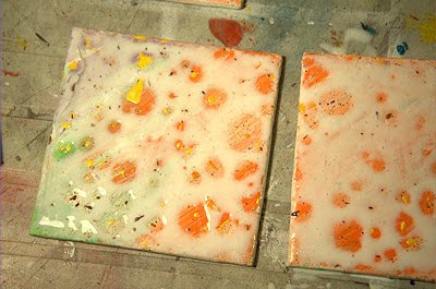 |
| Picture 4: the stuff isn't adhering - a disaster! |
So I don't think I actually used aerosols on this one. The white base was covered in some standard acrylic paint, very roughly, orange, green and purple, to lay down a base for future operations. It's always funny to think that hardly any of this first stage will be visible in the end, but it's an essential step nevertheless.
Then I did a bit of spattering with an old toothbrush using more or less the same colours but concentrated (undiluted) hence darker to add interest and have echoes of the same colours but in different tones. You can also see that I'm painting three pics at the same time which I'm going to put up in three different locations around the city but in different configurations for fun. If you don't know what I'm on about then check out this page where all is revealed about the infinity squared concept (infini2 in French).
 |
| Picture 5: adding the second, paint-coloured layer |
In picture 3 the fun really starts. Here I've just put on this weird stuff to make paint crack up beautifully but it's a bit haphazard and in picture 4 you can see that a disaster has happened! Where there are little raised spatters of paint from the previous stage the special crackling liquid hasn't stuck and has retreated to leave large circular areas uncovered. Oh no! What to do what to do?
Well, I decided to let it dry anyway, but after having put on a very generous layer as stated on the bottle it took absolutely ages and I broke an electric dryer trying to speed up the process. Then came the best bit, where you mix the second crackling agent to your paint and put it on top. And then a miracle happens. In just a few seconds the paint you've just put on starts to crack up - it's fascinating to watch.
 |
| Picture 6: the crackling process has worked! |
Picture 5 shows the special liquid being painted on from the egg cups where I mixed with paint, and in picture 6 you can see that I've added the purple, the green is finished, and the paint has cracked up beautifully - phew!
I know the effect is just out of a bottle which makes me wonder if I'm cheating in some way, but then I think, hell, no! I'm getting my fingers dirty and I'm painting it on and producing the results and it's just another of the many tools available to me to produce original work. Of course, if I used that effect every time it would probably lose it's aesthetic appeal (familiarity breeds contempt) but for now it's serving me well.
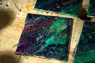 |
| Picture 7: a close up of the cracked up paint effect |
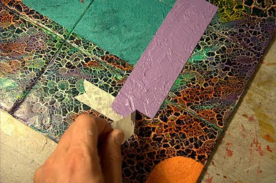
I decided to try to reproduce a picture I'm fond of from a while ago now, and you can see it standing up in a little black frame in picture 8. You can also see that the painting has moved on again and that I am adding the green and purple rectangles and also the orange circle. I've based these shapes on a gritty mortar with a blue tint which dulls down the original bright colours. In addition, it dries much darker than when it's wet, and as I want these shapes to be really light to contrast with the darkish background I generally have to repaint them lighter after they've dried. That was the case here.
I've used masking tape to get nice sharp lines to start off with,whereas in the little original I didn't, and in retrospect I should have done them freehand again, as they look to clinical. In running over the rectangles again I've left a few gaps to let bits of the darker gritty bit to show through but I'm not entirely happy with the result, but let's move on.
 |
| Picture 8: the original little picture that I'm reproducing here |
It's still a lovely moment when you do actually take the masking tape off though and discover that you have a perfectly straight line of paint - makes you feel like a real pro!
So having said that I then tried to half mess up those too-perfect lines with the lighter coat but didn't like that either so wasn't quite sure what to do.
I consoled myself by adding some nice rich colours to the orange circle and the whole thing is going to be covered by some glossy layers and a final spray on coating to try and protect it from the elements but only time will tell if it's any good.
 |
| Picture 9: the magical creation of perfectly straight lines! |
I've been thinking a lot about what direction my art should take recently and I'm still being influenced by the realisation I had a few years ago that practically every known artist has developed an individual style which is instantly recognisable. I realised that I had discovered my 'thing' when the infinity squared idea hit me like a train and that's still storming ahead full steam. What I am worrying about though is whether there is any unifying element to my work other than those darn nine squares, and if not, does matter?
I'm still far too 'young' as an artist, and too excited about trying loads of different styles to want to limit myself in that way. And yet I've seen that no-one who doesn't have a recognisable style gets anywhere. I'm not too worried, as I'm currently reading some a wonderfully inspirational book simply called Abstract Painting by Rolina van Vliet who's Dutch. Her approach is great and totally for experimenting and trying stuff out. She also recommends closing the book before trying out a particular technique so you are not too influenced by any of the illustrations or tempted to copy them - great.
 |
| Picture 10: moving towards completion at last |
Having said that the illustrations are superb and very inspirational and I'm getting lots from it. So to sum those thoughts up, I'm feeling ok about sticking religiously to my infini2 theme whilst still experimenting like crazy with any new ideas or techniques that come my way. You'll see all the results here, I promise.
I've also realised that a lot of these pics here seem rather dark, but if you can imagine the conditions under which they were taken, in a dim basement, and then processed, at night in a dark room, it's very difficult to get the brightness right. I try to get them as close to the originals as possible but variations are inevitable I'm afraid. Especially when some of the pics are taken under dim artificial light and others in bright sunlight.
 |
| Picture 11: you can see the little irregular circles well here |
Here are a couple of shots of the (almost) final works. I can't wait to get out into the streets of Paris some dark evening soon and put them up! I'm pretty pleased with them in the end I reckon. I love the richness of the orange but here it's still wet, so I'm not quite sure how bright it'll be in the end.
Once the pictures are finally finished and 'out there' I'll post the final piece to the infini2 blog as part of my final gallery of work, and I'll probably update this post too to include the final version, but do feel free to comment here beforehand on anything you like.
I hope that these outpourings of thoughts, which I admit are pretty narcissistic and subjective, are nevertheless of some interest and maybe use to some of you out there. Of course I'd love to hear from you and read your thoughts on anything to do with the painting process. And thanks for reading!
_________________________________________________________________________________________________
© 2010 Sab Will / Paris Set Me Free - Contact me directly for enquiries about buying paintings, interviews, etc.
© 2010 Sab Will / Paris Set Me Free - Contact me directly for enquiries about buying paintings, interviews, etc.


